You can create your own simple thresholds and corresponding formatting options to apply conditional formatting to a control in your document. For example, if you want all revenue values over $40,000 formatted in a red, Arial font, you can create and format a threshold for that range. On the same report, you can have all revenue values below $10,000 appear as an image of an arrow pointing down. Simple thresholds consist of one expression; for example, one threshold can calculate a revenue that is greater than $10,000.
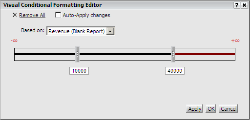
You can create simple thresholds to apply conditional formatting using the Visual Conditional Formatting Editor, as shown in the image below.
Notice the horizontal threshold bar in the Visual Conditional Formatting Editor. This is the threshold bar in which you define different ranges of values and format your new thresholds. You use sliders to create different ranges of values and determine how each range is formatted. Each slider on the bar represents a different threshold. You add and move sliders along the threshold area to define different thresholds. For example, suppose you want to view two different thresholds for the Daily Revenue metric: one threshold to highlight revenue data above $40,000 and another threshold to highlight revenue data less than $10,000. You can create one slider for 10,000 and one for 40,000, then apply formatting to the values below 10,000, and above 40,000.
Open the document in Design or Editable Mode.
Right-click the control you want to format in the document layout area, point to Conditional Formatting, then select Visual. The Visual Conditional Formatting Editor opens.
Specify
the threshold's qualifications
The first step in creating a threshold is to specify its qualifications.
Examples of qualifications include Top 5% of Daily Revenue or Profit over
$40,000.
From the Based on drop-down list, select the metric on which to base the qualification. For example, to ensure that the threshold simply highlights Daily Revenue values over $40,000, select Daily Revenue from the drop-down list.
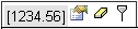
Drag the cursor over the threshold
bar. A small pop-up menu is displayed, as shown below.
Click the slider. In the Enter
value field, type the number for which you want to define the threshold,
then click the Apply icon  .
For example, in the scenario described above, you can type 40000
to create a slider for $40,000.
.
For example, in the scenario described above, you can type 40000
to create a slider for $40,000.
Specify
the formatting for the threshold
After you define the
threshold conditions, you must specify a format for the thresholds. This
is the step in which you consider such questions as "How should the
revenue data that is above $40,000 be highlighted on the report? Should
the values be formatted with a different color and font? Should they be
replaced by text or a symbol?
The area between two sliders on the threshold bar represents the range between two values. Do one of the following:
Drag the
cursor over the threshold slider to format. In the pop-up menu that opens,
select the Format  icon. The Format dialog box opens.
Double-click a specific area of the threshold bar to format that threshold range. The Format dialog box opens.
Specify a name for the threshold in the Name field, if desired.
To replace the threshold values with text, an image, or a quick symbol, select the Replace Data check box and select one of the following from the drop-down list:
Replace
Text: Replace data with any text you specify. For example, a document
shows the financial values of various sales opportunities. For those sales
opportunities that have been lost, you might display the word LOST in
red, rather than displaying the financial value. A common use of this
option is to display the word EMPTY when a data value is null.
If you select this option, type the text with which to replace
the values in the corresponding text field.
Quick
Symbol: Replace the normally displayed data with a common symbol.
For example, a document shows the financial contribution of various sales
groups to overall sales office activity. For the monthly trend column
you could show either a green plus (+) or a red minus (-) symbol to represent
positive or negative contribution trends.
If you select this option, select the symbol with which to replace
the values from the corresponding drop-down menu.
Image: Replace the normally displayed data with an image, such as an arrow or green dot. You can specify the path to the image by typing the address using one of the following:
Absolute path: The default, for example, c:/images/img.jpg
Relative to HTML Document directory: A relative path from the document directory where the image is stored, for example, images/img.jpg
On the network: A path on the local area network, which is in a UNC (Universal Naming Convention) format, for example, //machine_name/shared_folder/img.jpg
On the web: A URL to an image file, for example: http://www.microstrategy.com/images/img.jpg
To format the threshold values by
adjusting the font, color, alignment, and other options, make the appropriate
selections within the Font, Number, Alignment, and Color and Lines tabs.
See
Format Thresholds Editor
for more information on the options available. The text sample on the
left of the threshold pop-up menu presents an example of the formatting you
specified for the threshold.
To add additional thresholds, in the
pop-up menu, click the Add Threshold
 icon. A new slider is added to the threshold bar. The slider's initial
location differs depending on the kind of qualification you specified
previously. Repeat the appropriate steps above to define the additional
thresholds.
icon. A new slider is added to the threshold bar. The slider's initial
location differs depending on the kind of qualification you specified
previously. Repeat the appropriate steps above to define the additional
thresholds.
Click OK
to apply changes and return to the document.
Note: If the Auto-Apply changes
check box is selected, your formatted thresholds are already visible on
your document.
Related topics