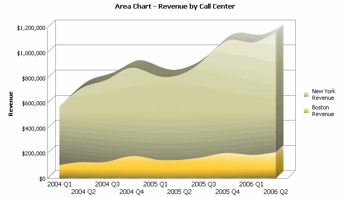
A graph report is a representation of data in a visual format that can help you see overall trends easily, identify medians and exceptions, and so on.

Graph view shows the data in a graphical format after report execution.
There are many different graph styles you can choose from to display your report data most effectively. For images and examples of the various graph styles, as well as data requirements for each graph style, see the Graphing chapter of the MicroStrategy Advanced Reporting Guide.
Graph styles available may include the following:
Bar
Line
Area
Pie
Scatter
Bubble
Radar
Polar
Gauge
A graph report shows numerical values as points, lines, bars, or circles, and it shows non-numerical data as reference axes. When a grid report is displayed as a graph, the results from the cells in the grid provide the shape of the graph, while the column and row headings in the grid become the axes of the graph.
Graphs consist of categories and series. See the section below for a definition of categories and series, and how to set the number of categories and series displayed at one time.
Click the name of a report to execute it.
Click the Graph
icon  on
the toolbar.
If left and right arrows 
 appear below a graph, the graph contains more
series than can be displayed on a single page at a time. You can view
additional data by clicking the left or right arrows.
Setting the number of categories and series displayed on a graph determines how much row and column data you view at one time.
The table below defines categories and series and what they represent on a graph report.
|
Graphing Term |
Definition/How it appears in reports |
|
Categories |
|
|
Series
|
|
You can adjust the number of categories and series using the scrolling bars and sliders, or by using the steps below.
In a graph report, from the Format menu select Graph. The Format: Graph dialog box opens.
If DHTML is disabled, click the Go check mark.
On the General tab, in the Categories field, type the maximum number of categories.
In the Series field, type the maximum number of series.
Click Apply to apply your changes to the graph.
The maximum categories and series are saved with the report definition when the report is saved.
Related topics