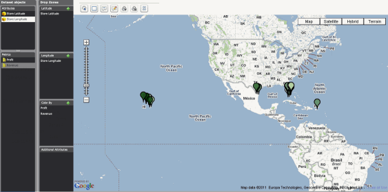
You can add a Google Map visualization to a Visual Insight analysis, to display your data as map markers on an interactive map. You can use the visualization to:
Filter the map markers shown in the visualization by selecting map markers for which to display data.
Display map markers as static images in the visualization, or display the map markers as dynamic bubbles. If you choose to display the map markers as dynamic bubbles, the size of each dynamic bubble is automatically determined based on the value of the metric used to display the map markers, with the largest bubbles being displayed for the largest metric values.
Display Information Windows with additional information about a location when the user hovers the cursor over a map marker in the visualization.
The Google Map visualization is similar to the Google Map custom widget, which allows you to display locations as map markers, show relationships between locations as lines between the map markers, and display and edit custom Information Windows with additional information about a location when a user clicks a map marker in the widget. The Google Map custom widget can be added to a document and displayed in Interactive Mode, Express Mode, or Flash Mode in Web, or used to display a report as a Google Map widget. For background information and steps to enable the custom Google Map widget to be displayed in Web, see the GIS Integration Help.
This procedure assumes you have already created two separate attributes that provide the geographical location of each map marker to display in the Google Map visualization. The attributes must provide this information for each map marker, as follows:
You must provide one attribute that contains the latitude of each map marker.
You must provide one attribute that contains the longitude of each map marker.
You must register your customer domain with Google and obtain a Google Maps API key. For background information on registering your customer domain and detailed steps, see the GIS Integration Help.
You must deploy and configure the Google Map Connector plugin. For detailed steps, see the GIS Integration Help.
You must have the Web Visual Insight and Execute Document or Analysis privileges.
Click the name of the analysis to run it.
From the analysis toolbar, click the
Add Visualization icon ![]() ,
then select Google Map.
,
then select Google Map.
From the Dataset Objects panel, click and drag the attribute that contains the latitude information to the Latitude area in the Drop Zones panel.
From the Dataset Objects panel, click and drag the attribute that contains the longitude information to the Longitude area in the Drop Zones panel.
You can use static images as map markers for locations displayed in the Google Map visualization, or display the map markers as dynamic bubbles. The size of each dynamic bubble is automatically based on the value of the first metric in the Color By area of the Drop Zones panel. From the Drop Zones panel, perform the following steps:
Hover the cursor over the name of the Color By area, then click the arrow icon to the right. From the list of options, select one of the following:
To display the map markers as images, select Color By.
To display the map markers as dynamic bubbles, select Size By. The Color By area is renamed to the Size By area.
From the Dataset Objects panel, click and drag the metrics you want to use to display the map markers to the Color By/Size By area in the Drop Zones panel. The first metric displayed in this area is used to display map markers in the widget. You can click and drag the names of the metrics to rearrange them.
You can display the map markers in different colors or replace the map markers with different images based on the value of the metric. To do so, you must define a threshold on the metric used to display the map markers. Click the arrow icon to the right of the metric in the Color By/Size By area, then select Thresholds. The Thresholds dialog box opens. Select the appropriate options to define a threshold on the metric. Detailed steps to define the threshold are below.
By default, when a user hovers the cursor over a map marker in the widget, an Information Window containing additional information about the location is displayed. You can include additional attributes to be displayed in the Information Window. To do so, from the Dataset Objects panel, click and drag the attributes you want to display to the Additional Attributes area in the Drop Zones panel.
To save your analysis, click the Save icon ![]() . The Save As dialog box is displayed.
. The Save As dialog box is displayed.
Navigate to the location in which you want to save the analysis, then type a name and description for the analysis in the Name and Description fields.
This procedure assumes that you have already created an analysis with the Google Map visualization for which you want to define a threshold.
From the Drop Zones panel, hover the cursor over the name of the metric in the Color By/Size By area, then click the arrow icon on the right. A list of options is displayed.
Select Thresholds. The Threshold dialog box opens.
From the Show drop-down list, select the type of threshold you want to define, as follows:
To create a threshold to change the color used to display map markers, select Band Color. If image markers are displayed in the widget, the map markers will be displayed as colored circles.
To create a threshold to replace map markers with images, select the type of image you want to display. The options include:
Flags 
Regular Pin 
Rounded Pin 
From the Based on drop-down list, select the metric to use to define the threshold.
From the second drop-down list, select one of the following:
To create a threshold based on the value of the metric, select Value. For example, you can display metric values greater than 5 million in blue.
To create a threshold based on the top and bottom x metric values, select Rank. For example, you can display the top 5 metric values in red, and display the bottom 5 metric values in green.
To create a threshold based on the top and bottom x percent of metric values, select Percent. For example, you can display the top 10% of metric values with a green flag, the next 40% of metric values with a yellow flag, and the bottom 50% of metric values with a red flag.
Each band displayed in the dialog
box represents a different range of values. You can click and drag an
indicator left or right along the slider to increase or decrease the range
of values covered by the band.
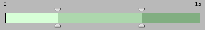
Do one of the following:
To create a new band, press CTRL and click on a band to divide it into two separate bands.
To change the color applied to the range of values covered by a band, double-click the band, then select the new color from the color palette.
To delete a band, hover the cursor over the band, then click the x icon. The band is deleted.
Click OK. The threshold is created.
By default, the names and values of attributes and metrics added to the visualization are displayed in the Information Window. You can customize the display by adding HTML, plain text, or attribute and metric values to the Information Window.
From the Google Map's toolbar, click
the Edit Information Window icon .
The Edit Custom Info Window dialog box opens.
.
The Edit Custom Info Window dialog box opens.
In the field, type the text you want to display in the Information Window, as follows:
To add plain text or HTML to the Information Window, type the text you want to display in the field. For example, you can type <b>Location:</b> to display the word Location in bold.
To display
the value of an attribute or metric, type ${Name},
replacing Name with
the name of the attribute or metric whose value you want to display. The
text is replaced with the value of the attribute or metric when the Information
Window is displayed.
Note: Once you have modified the contents of the Information
Window to display custom information, you can choose to revert these changes
and display the default Information Window instead. To do so, delete the
contents of the field in the Edit Custom Info Window dialog box, then
click OK. Your changes are reverted.
Click OK. Your changes are saved.
Related topic