The Graph Matrix visualization is a powerful, interactive visualization that allows you to display your data using a variety of graph styles, such as the line graph, bubble graph, or grid, then customize it to suit users' needs. For example, you can:
Organize the data displayed in the graph based on a specific attribute. For example, a bar graph contains units sold data for several regions. You can choose to display a different bar for each individual store within each region.
Color graph elements (such as bubbles, lines, or bar risers) by an attribute or a metric. For example, you can choose to display a different color for each element in an attribute. You can choose to have graph elements automatically colored based on the value of a metric, with the darkest colors being displayed for the largest metric values.
Automatically size graph elements based on the value of a metric, with the largest elements being displayed for the largest metric values.
Slice your data, by displaying a graph for each combination of attribute elements in the rows and columns of the Graph Matrix visualization. For example, you can display the revenue data for each Region as a separate line graph, or display a bar graph containing store sales for each year.
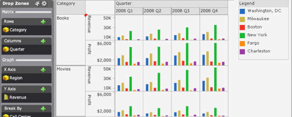
An example of a Graph Matrix visualization is displayed in the image below. The data in the visualization is shown as a series of bar graphs, with a separate bar riser displayed for each Call Center. The bar riser for each Call Center is displayed in a different color. Finally, the data is sliced to display a separate graph for the revenue and profit data for each product category by quarter.
To design a Graph Matrix visualization, you should perform the following basic steps:
Determine the graph style you want to use, based on the data you want to display. For example images and data requirements for each graph style, see the table below.
Add attributes and metrics to the visualization, to display the data using the graph style you have chosen.
Select additional display options, such as whether to size or color graph elements (such as bar risers or bubbles) based on attributes or metric values.
Slice the data to show the graphs at the level of data you want to display.
To create a Graph Matrix widget to be displayed in a Report Services document, create a Graph Matrix visualization in a Visual Insight analysis, then convert the analysis to a document. For steps to create and add a Graph Matrix visualization in an analysis, see To add a Graph Matrix visualization to an analysis.
The table below contains example images and data requirements for each graph style available for the Graph matrix visualization.
|
Graph Style |
Requirements |
Example |
|
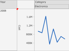
Line You can display the data as a vertical or horizontal line graph, to allow users to view lines representing metric values for each element of an attribute. |
To create a graph using the Line graph style, place report objects on the Drop Zones panel, as follows:
|
|
|
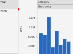
Bar You can display the data as a vertical or horizontal bar graph, to allow users to view bars representing metric values for each element of an attribute. |
To create a graph using the Bar graph style, place report objects on the Drop Zones panel, as follows:
|
|
|
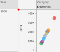
Scatter You can display a scatter plot that allows users to visualize the trends of two different metrics for a set of attribute elements. |
To create a graph using the Scatter graph style, place report objects on the Drop Zones panel, as follows:
|
|
|
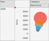
Bubble You can display a bubble plot that allows users to visualize the trends of three different metrics for a set of attribute elements. |
To create a graph using the Bubble graph style, place report objects on the Drop Zones panel, as follows:
|
|
|
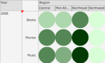
Grid You can use the Grid style to allow users to identify trends across combinations of data. Each marker in the grid can be automatically sized or colored based on the value of a metric. For example, in the image to the right, a separate bubble is displayed for each combination of region and product category. Bubbles representing large revenue values are displayed in dark green, and bubbles for smaller revenue values are displayed in light green. |
To create a graph using the Grid graph style, place report objects on the Drop Zones panel, as follows:
|
|
You must have the Web Visual Insight and Execute Document or Analysis privileges.
You should
be familiar with the Metrics object and how it can be used to display
data in a Graph Matrix visualization. The Metrics object is an attribute
unique to Visual Insight, which contains the names of each metric placed
on the X Axis area or Y Axis area in the visualization's Drop Zones panel.
It is automatically added to the Rows or Columns area when you place a
metric on the Drop Zones panel.
You can drag and drop the Metrics object to the Drop Zones panel as
you would an attribute. For example, you can add the Metrics object to
the Rows area to display a graph row for each metric. You can add the
Metrics object to the Break By area to display a different graph element
for each metric.
Click the name of the analysis to run it.
Click the Add
Visualization icon ![]() , then select Graph
Matrix. To add data to the visualization, from the
Dataset Objects panel, drag and
drop report objects to the Drop
Zones panel, as described in the steps below.
, then select Graph
Matrix. To add data to the visualization, from the
Dataset Objects panel, drag and
drop report objects to the Drop
Zones panel, as described in the steps below.
Note: If the Dataset Objects
panel is not displayed, click the Dataset
Objects icon in the analysis toolbar. If the Drop
Zones panel is not displayed, click the Drop
Zones icon in the analysis toolbar.
To display attribute elements or metric values on the horizontal axis of the graph, place attributes or metrics on the X Axis area, as follows:
To display
attribute elements along the horizontal axis of the graph, place at least
one attribute on the X Axis area.
If you place two or more attributes on the horizontal axis, each combination
of attribute elements is displayed. For example, if the X
Axis area contains the Year attribute and the Category attribute,
labels appear on the horizontal axis for 2009 Books, 2009 Electronics,
and so on.
Note: If you add more than one attribute to a bar graph,
the bar graph is automatically displayed as clustered. You can click and
drag the attributes in the X Axis
area to change the order in which the bars are clustered and displayed.
To graph and display metric values along the horizontal axis, place at least one metric on the X Axis area.
To display attribute elements or metric values on the vertical axis of the graph, place attributes or metrics on the Y Axis area, as follows:
To display
attribute elements along the vertical axis of the graph, drag and drop
at least one attribute to the Y Axis
area. If you place two or more attributes on the vertical axis, each combination
of attribute elements is displayed. For example, if the Y
Axis area contains the Year attribute and the Category attribute,
labels appear on the vertical axis for 2009 Books, 2009 Electronics, and
so on.
Note: If you add more than one attribute to a bar graph,
the bar graph is automatically displayed as clustered. You can click and
drag the attributes in the Y Axis
area to change the order in which the bars are clustered and displayed.
To graph and display metric values along the vertical axis, place at least one metric on the Y Axis area.
You can display a separate graph element
in the visualization for each attribute element in an attribute. For example,
you can display the revenue data for each Region as a separate line graph,
or display a bar riser for each year of data. To do so, place attributes
in the Break By area. If you add
more than one attribute to the Break
By area, a graph element is displayed for each combination of the
attribute elements.
Note: For line graphs and bar graphs, you can add an attribute
to the Break By area to display
stacked lines or stacked bars. The Break
By area is not available for the Grid style.
You can color the graph elements by an attribute or metric. For example, you can display the sales data for each employee using a different bar riser color (color by attribute). You can automatically color the bubbles in a graph displayed using the Grid style based on the value of a metric, with larger values displayed using darker colors and smaller values displayed using lighter colors (color by metric). To color graph elements by an attribute or metric, place report objects on the Color By area of the Drop Zones panel, as follows:
To color the graph elements using an attribute, place an attribute on the Color By area. The graph elements in the visualization are automatically assigned a different color for each element in the attribute.
To color graph elements based on the value of a metric, place a metric on the Color By area. The graph elements in the visualization are automatically shaded based on the value of the metric.
To have the graph elements automatically sized based on the value of a metric, place one metric in the Size By area. Graph elements corresponding to large metric values are automatically displayed as larger in size, while graph elements for small metric values are displayed as smaller in size.
Once you have added data to the graph, you can choose to slice the data to customize the graph display. You can choose to display a graph for each element in an attribute, then display them in separate columns, rows, or both. If you choose to slice the data to display graphs using both rows and columns, a matrix of graphs is displayed with a graph for each combination of the attribute elements. In the Drop Zones panel, click the arrow icon next to the Matrix area, then do one or both of the following:
To display a row of graphs in the visualization, with a separate graph for every element in an attribute, place at least one attribute in the Rows area. Each graph is displayed in a separate row.
To display a column of graphs in the visualization, with a separate graph for every element in an attribute, place at least one attribute in the Columns area. Each graph is displayed in a separate column.
To display additional metrics in a tooltip when a user hovers the cursor over a graph element, place the metrics you want to display on the Additional Metrics area.
To save your analysis, click the Save As icon ![]() . The Save As dialog box is displayed.
. The Save As dialog box is displayed.
Navigate to the location in which you want to save the analysis, then type a name and description for the analysis in the Name and Description fields.
Related topics