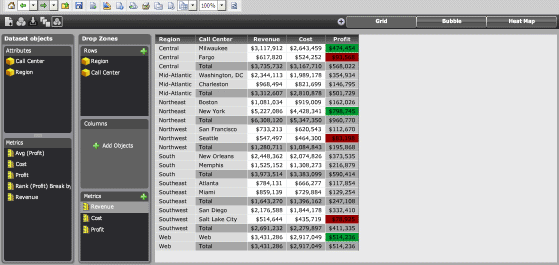
Once you create a Visual Insight analysis, you can add a Grid visualization to the analysis to display attributes and metrics in a tabular layout, as shown in the image below.
Users can quickly interact with data in the grid to customize their view of the information displayed in the visualization. For example, they can:
Sort attribute elements or metric values in ascending or descending order, or use multiple conditions to sort data.
Rearrange attributes and metrics, or swap the rows and columns displayed in the grid.
Filter data to display only selected attribute elements or metric values.
Add and display subtotals in the grid.
You must have the Web Visual Insight and Execute Document or Analysis privileges.
Click the name of the analysis to run it.
Click the
Add Visualization icon ![]() , then select Grid.
, then select Grid.
To add data to the visualization,
from the Dataset Objects panel,
click and drag attributes and metrics to the Drop
Zones panel, as follows:
Note: If the Dataset Objects panel is not displayed, click the
Dataset Objects icon in the analysis
toolbar.
To add an attribute to the rows, drag the attribute to the Rows area.
To add an attribute to the columns, drag the attribute to the Columns area.
To add a metric to the analysis, drag the metric to the Metric area. The Metrics object, an attribute unique to Visual Insight, is automatically added to the Dataset Objects panel. You can drag and drop the Metrics object to the Rows or Columns area of the Drop Zones panel, to change whether the metrics are displayed on the rows or columns of the grid.
You can create new metrics using the metrics in the analysis's dataset, change the display of data by adding thresholds to the analysis, and so on. For steps to perform a specific task, see the appropriate topic below:
To save your analysis, click the Save As icon ![]() . The Save As dialog box is displayed.
. The Save As dialog box is displayed.
Navigate to the location in which you want to save the analysis, then type a name and description for the analysis in the Name and Description fields.
Related topics