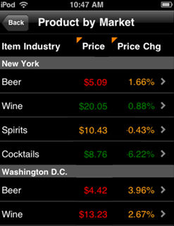
The Interactive Grid widget allows you to display data in a compact tabular layout on an iPhone or iPad with MicroStrategy Mobile. Attributes and metric values are displayed in columns in the widget's grid, as shown below. If a column contains more than one attribute or metric, users can toggle the value displayed in the column to customize their display, or stack the attribute and metric values to display each of the values together in a single row.
For general information on iPhone and iPad widgets, see About iPhone and iPad widgets.
An Interactive Grid widget displays as a:
widget, grid report, or graph report on the iPhone
grid or graph report in Flash Mode in MicroStrategy Web
grid or graph report or a placeholder, or can be hidden, in Interactive mode and Express mode (DHTML) in MicroStrategy Web, PDF View in Desktop, and when exported to PDF or Excel. For more information on the alternative display setting, see Determining how a widget is rendered in non-Flash modes.
You can allow users to directly edit the data displayed in the interactive grid using an iPhone or iPad. For example, you create a widget to display a list of time off requests. A user can tap a button next to each request to display a check mark for approved requests and an X for rejected requests, then submit their changes to their data source. To enable users to edit the data displayed in the widget, you must link the widget's Grid/Graph to a Transaction Services report. For detailed steps to link a grid in a document to a Transaction Services report, see the Report Services Document Creation Guide.
You can allow users to perform an action when they tap an attribute or metric in the widget on an iPhone or iPad. For example, several customer regions are displayed in an Interactive Grid widget. The Customer Region attribute is enabled as a selector and targets a panel stack in the document. You can allow users to tap the name of a customer region to display data in the panel stack only for the selected region.
In order to perform an action when the user taps a value on the iPhone or iPad, you must enable the action on the widget's Grid/Graph in Web. Only one action can be performed for each attribute or metric displayed in the widget. If more than one action is enabled for an attribute or metric, the action with the highest priority is performed. You can enable the following actions for a value in the widget, in order of highest to lowest priority:
Allow users to edit data for the attribute or metric, by displaying the attribute or metric as an input object control in a Transaction Services-enabled document. For detailed steps, see the Report Services Document Creation Guide.
Use an attribute or metric on the widget's Grid/Graph as a selector. For steps, see Enabling a Grid/Graph as a selector to control another Grid/Graph.
Add a link to a report or document. For steps, see Linking in widgets.
Allow drilling on an attribute element in the Grid/Graph. For steps, see Enabling drilling on a Grid/Graph.
You can select a default action to perform for attributes and metrics that have no action defined on the widget's Grid/Graph, by selecting an attribute that already has an action defined for it. This action will automatically be performed when a user taps the value in the widget. Steps to select a default action for the widget are included below.
You can display a report as an Interactive Grid widget, or add an Interactive Grid widget to a document. The widget is then displayed when the report or document is viewed on an iPhone or iPad with MicroStrategy Mobile. The following procedures provide separate steps to add an Interactive Grid widget to a report or document.
Open the document in Design or Editable Mode.
From the Insert menu, point to Widgets, then iPhone/iPad. Select Interactive Grid.
Click the location on your document where you want to place the widget. If desired, resize the Grid/Graph by clicking and dragging its handles.
From the Dataset Objects panel on the left, select attributes and metrics, and drag them on top of the widget, as described below.
Place at least one attribute on the Grid/Graph's rows. The elements of this attribute are displayed in the first column of the widget.
Place at least one metric on the Grid/Graph's columns. The metric values are displayed in additional columns in the widget.
Configure the widget's display properties
Right-click the widget, then select Properties and Formatting. The Properties and Formatting dialog box opens.
From the left, select Widget.
Click the Widget
Properties icon  . The Interactive Grid Properties dialog box opens.
By default, the rows of the widget are not banded. To apply banding to the widget, select the Banding check box.
By default, the width of the columns in the widget is automatically determined. You can do one of the following:
To determine the width of the columns automatically, select the Automatic column sizing check box.
To manually specify the width of each column, clear the Automatic column sizing check box.
In the Width (%) fields, specify the width of each column as a percentage. The widths for all columns should add up to 100.
You can allow users to group the data displayed in the widget by selecting an attribute element. Do one of the following:
To allow users to group the data displayed in the widget, select the Group by check box. The first attribute on the widget's Grid/Graph is automatically used to group the data when the widget is viewed on an iPhone or iPad.
To display the widget without grouping its data, clear the Group by check box.
From the Color Theme drop-down list, select a color theme to use to display the background color, border color, and header color of the widget. The options are:
White
Black
Gray
Transparent
You can select a default action (such as drilling on an attribute, or opening a report or document) to perform for attributes and metrics that have no action defined on the widget's Grid/Graph. From the Default Action Form drop-down list, select an attribute. The action defined for this attribute will automatically be performed when a user taps a value in the widget for which no action is explicitly defined.
If you place multiple attributes or metrics in a column, you can choose whether to display each attribute or metric value as stacked together in a single row in the widget, or allow the user to tap the header of a column on the iPhone or iPad to change which attribute or metric value is displayed. Do one of the following:
To allow users to tap a column header to change which attribute or metric value is displayed, select the Toggle With Headers check box.
To display each attribute or metric value as stacked values in a single row, clear the Toggle With Headers check box. Column headers are not displayed when values are displayed as stacked.
You can create, rearrange, or delete columns in the widget:
To rearrange report objects within the columns, click a report object and drag it to a new location.
To add a new column to the grid, click Add Column. The new column is added and displayed.
To delete
a column, click  to the right of the column.
Note: The first two columns in the widget are added to the
widget by default and cannot be deleted.
Click OK to return to the Properties and Formatting dialog box.
Click OK again to save changes.
The Custom Visualizations Editor must be enabled. For more information on the Custom Visualizations Editor, see the Web Administrator Help.
This procedure assumes you have already created a report with the following requirements:
At least one attribute on the grid's rows. The elements of this attribute are displayed in the first column of the widget.
At least one metric on the grid's columns. The metric values are displayed in additional columns in the widget.
Click the name of the report to run it.
From the Tools menu, select Custom Visualizations. The Custom Visualizations dialog box opens.
From the iPhone drop-down list, select Interactive Grid.
Click the Widget
Properties icon . The Interactive Grid Properties dialog box opens.
By default, the rows of the widget are not banded. To apply banding to the widget, select the Banding check box.
By default, the width of the columns in the widget is automatically determined. You can do one of the following:
To determine the width of the columns automatically, select the Automatic column sizing check box.
To manually specify the width of each column, clear the Automatic column sizing check box.
In the Width (%) fields, specify the width of each column as a percentage. The widths for all columns should add up to 100.
You can allow users to group the data displayed in the widget by selecting an attribute element. Do one of the following:
To allow users to group the data displayed in the widget, select the Group by check box. The first attribute on the widget's Grid/Graph is automatically used to group the data when the widget is viewed on an iPhone or iPad.
To display the widget without grouping its data, clear the Group by check box.
From the Color Theme drop-down list, select a color theme to use to display the background color, border color, and header color of the widget. The options are:
White
Black
Gray
Transparent
You can select a default action (such as drilling on an attribute, or opening a report or document) to perform for attributes and metrics that have no action defined on the widget's Grid/Graph. From the Default Action Form drop-down list, select an attribute. The action defined for this attribute will automatically be performed when a user taps a value in the widget for which no action is explicitly defined.
If you place multiple attributes or metrics in a column, you can choose whether to display each attribute or metric value as stacked together in a single row in the widget, or allow the user to tap the header of a column on the iPhone or iPad to change which attribute or metric value is displayed. Do one of the following:
To allow users to tap a column header to change which attribute or metric value is displayed, select the Toggle With Headers check box.
To display each attribute or metric value as stacked values in a single row, clear the Toggle With Headers check box. Column headers are not displayed when values are displayed as stacked.
You can create, rearrange, or delete columns in the widget:
To rearrange report objects within the columns, click a report object and drag it to a new location.
To add a new column to the grid, click Add Column. The new column is added and displayed.
To delete
a column, click to the right of the column.
Note: The first two columns in the widget are added to the
widget by default and cannot be deleted.
Click OK to return to the Custom Visualizations dialog box.
Click OK again to save changes.
Related topic