An Interactive Bubble Graph widget is a conventional bubble plot that allows you to visualize the trends of three different metrics for a set of attribute elements. The data structure for an Interactive Bubble Graph widget is very specific. At minimum, one attribute and three metrics are required. In the bubble graph:
One bubble is displayed for each attribute element.
Each bubble's position on the X-axis represents the value of the first metric.
Each bubble's position on the Y-axis represents the value of the second metric.
The size
of each bubble represents the value of the third metric.
Note: To ensure that different groups of attribute elements
are displayed as different colored bubbles, you can add a fourth attribute
above the first three metrics on the columns.
The Interactive Bubble Graph is interactive, unlike a standard bubble graph report. For example:
Analysts
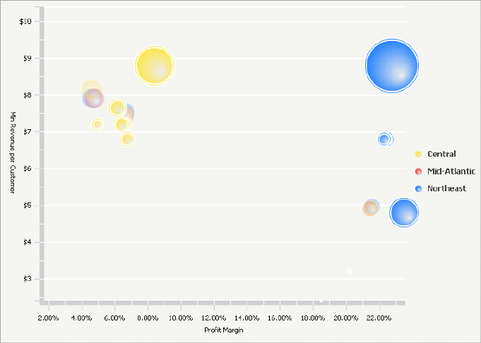
can change which metric is displayed on which axis. For example, in the
widget shown above, the Profit Margin is displayed on the X-axis (the
horizontal axis) and the Minimum Revenue per Customer on the Y-axis (the
vertical axis). An analyst can switch the metrics, so that the Profit
Margin is shown on the Y-axis, and the Minimum Revenue per Customer on
the X-axis.
You can disable the ability to change which metric is displayed on
which axis. For steps, see
Formatting an Interactive
Bubble Graph widget.
Analysts
can zoom into a section of the widget to enlarge it. For example, he can
draw a selection box (or lasso) around a cluster of bubbles, and enlarge
that area of the widget, to focus on the information for those cities.
He can then return to the original view of the widget.
You can disable the ability to zoom in on a section of the widget.
For steps, see
Formatting an Interactive Bubble
Graph widget.
Analysts can drill into the components of a bubble to see the underlying data within that bubble's data. For example, an analyst can drill on a Region bubble (the parent attribute) down to bubbles that represent different cities (child attributes) within that region. To drill on a bubble in the bubble graph, the analyst clicks on any of the parent attribute bubbles. To enable drilling in the bubble graph, the designer must add an additional attribute to the right of the other attribute on the rows of the Grid/Graph that contains the widget. For steps to enable this features, see Formatting an Interactive Bubble Graph widget.
Analysts
can see a time-series animation that plots the bubble values through time,
if a designer added this functionality. To see the animation, an analyst
must move the time slider or click the animation play button.
To enable time series animation in the chart, a designer must place
an additional attribute in the left-most row of the Grid/Graph. If the
analyst is interested in both drilling and time series analysis, a designer
must place an additional attribute in the rows (for a total of 3 attributes
in the rows). For steps to enable this features, see
Formatting
an Interactive Bubble Graph widget.
To successfully create a useful Interactive Bubble Graph widget that can be used to analyze data, you must first correctly define the Grid/Graph. To do this, you must place report objects such as attributes and metrics on the Grid/Graph. The report objects and their placement on the Grid/Graph determine whether the Interactive Bubble Graph widget can be successfully generated and can display data in MicroStrategy Web.
The data requirements for a Interactive Bubble Graph widget are described below:
At least one attribute on the rows:
You must add at least one attribute to the rows. To enable drilling on
the bubble chart, add a second attribute to the right of the first attribute
in the rows. This attribute must be a child attribute of the first attribute.
For detailed information on this requirement, with an example, see
Enabling drilling in an Interactive
Bubble Graph widget.
To enable time series animation, add a third attribute to the left-most
side of the rows. In Flash Mode or Interactive
Mode, you must also enable the time-series analysis check box. For detailed
steps, see
Enabling time series animation
in an Interactive Bubble Graph widget.
To enable both drilling and time series animation, the Grid/Graph must
contain a total of three attributes.
At least three metrics on the columns: The first three metrics are displayed along the X-axis, Y-axis, and Z-axis, in order from left to right, by default. For example, the first metric is displayed on the X-axis. However, when viewing the widget, an analyst can change which metric displays along each axis. The Z-axis value determines the size of the bubbles.
An Interactive Bubble Graph widget does not need a separate selector to allow a user to interact with it. However, you can use an Interactive Bubble Graph widget as a selector that reflects its currently-viewed data in another Grid/Graph on the same document. For an example and more information, see Using an Interactive Bubble Graph widget as a selector.
Open the document in Design or Editable mode.
From the Insert menu, point to Widgets, then Flash. Select Interactive Bubble Graph.
Click the location on your document where you want to place the widget. The Grid/Graph is displayed. A small icon at the bottom right corner of the Grid/Graph identifies the type of widget you have added to the document.
If desired, resize the widget by clicking and dragging its handles.
Add objects to the Grid/Graph that contains the widget. To do this, from the Dataset Objects panel on the left, select attributes and metrics and drag them on top of the widget, using the following requirements:
Place at least one attribute in the rows.
To enable drilling on the bubble graph, add one additional attribute to the right of the attribute in the rows. For specific requirements to enable drilling, see Enabling drilling in an Interactive Bubble Graph widget.
To enable time series animation, add an additional attribute on the left-most side of the rows. For specific requirements to enable time series animation, see Enabling time series animation in an Interactive Bubble Graph widget.
Place at
least three metrics on the columns. The first three metrics are displayed
along the X-axis, Y-axis and Z-axis, in order from left to right, by default.
For example, the first metric is displayed on the X-axis. However, when
viewing the widget, an analyst can change which metric displays along
each axis. The Z-axis value determines the size of the bubbles.
Note: If you added a second attribute (to enable drilling)
or a third attribute (to enable time series analysis) to the Grid/Graph,
you must enable
drilling and/or
time series support in the widget.
For steps to enable this features, see
Formatting
an Interactive Bubble Graph widget.
View and test your results in one of two ways:
Select Flash Mode from the Home menu.
If Flash Mode is not available, you must make Flash Mode available in the document. For steps, see Defining which display modes are available to users.
Select Interactive Mode from the Home menu.
The widget must be enabled to be displayed in non-Flash modes to be viewable in Interactive Mode. For instructions to allow a widget to be displayed in non-Flash modes, see Determining how a widget is rendered in non-Flash modes.
Related topics