 ,
the widget is considered a type of Grid/Graph when it is selected.
,
the widget is considered a type of Grid/Graph when it is selected. A widget is a type of control, used on a Report Services document, that presents data in a visual and interactive way. You can think of widgets as interactive Flash-only graphs that dynamically update when an analyst selects a new set of data to view. Analysts can even interact with some types of widgets by clicking on the widget to select a set of data to analyze. You can use a variety of widget types, such as Gauge, Heat Map, and Interactive Stacked Area widget. Although each type of widget looks different and is used in a unique way, the main purpose of widgets is the same: to provide document analysts with a visual and interactive look into their data.
You can also display a report as a widget when it is viewed on an iPhone or iPad with MicroStrategy Mobile. For more information on iPhone and iPad widgets, see About iPad and iPhone widgets.
The following list briefly summarizes each type of widget that you can use in a document.
Bubble Grid: The Bubble Grid widget contains metric values that are plotted as bubbles of different colors and sizes; the colors and sizes of the bubbles represent the values of two distinct metrics on the Grid\Graph.
Cylinder: The Cylinder widget displays a vertical cylinder with fluid in it. The level of the fluid within the cylinder is a visual representation of a single metric value.
Data Cloud: The Data Cloud widget consists of a list of attribute elements. The font size of each attribute element represents a metric value for that element. These metric values represent the values of the first metric on the Grid/Graph.
Fish Eye: The Fish Eye Selector magnifies an item when you hover the cursor over it. This style of widget is useful because it allows you to choose from a large list of attribute elements, metrics, or images without having to see all of the elements, metrics, or images displayed at once.
Funnel: The Funnel widget can be used for a wide variety of business purposes, including application management, click management, pipeline analyses for sales forecasts, and sales process analysis.
Gauge: The Gauge widget displays a needle that moves within a range of numbers displayed on its outside edges. An example of a gauge is a car's speedometer.
Graph Matrix: The new Graph Matrix widget allows you to display data using different graph types, format the graphs, then slice the data to customize the display of the widget. To create a Graph Matrix widget, create a Visual Insight analysis with a Graph Matrix visualization, then convert the analysis to a document.
Graph Matrix (deprecated): The Graph Matrix widget displays actual values. Each area graph also has a line graph above it to show forecasted values. One graph is displayed for every combination of elements from the attributes on the Grid\Graph's rows and columns.
Heat Map: The Heat Map widget combination of colored rectangles, each representing an attribute element, that allow you to quickly grasp the state and impact of a large number of variables at once.
Interactive Bubble Graph: The Interactive Bubble Graph widget allows you to visualize the trends of three different metrics for a set of attribute elements.
Interactive Stacked Graph: The Interactive Stacked Graph widget is a combination of a check box list and area graph. The graph allows a user to see the contribution of various metric series to the change in value of a larger set of data.
Interactive Grid for the iPhone: The Interactive Grid widget allows you to display data in a compact tabular layout on an iPhone with MicroStrategy Mobile.
Map for the iPhone or iPad: The Map widget allows users to search and view information for locations on a map displayed on an iPhone or iPad with MicroStrategy Mobile.
Time Series for the iPhone or iPad: The Time Series widget allows you to display data over a specific period of time as a line graph on an iPhone or iPad with MicroStrategy Mobile.
Media: The Media widget allows you to present a variety of media, such as video, audio, images, or website content, on your dashboard. You can include media in the widget to provide background information about data or instructions on how to use the dashboard.
Microcharts: The Microcharts widget conveys information in such a way that the user can, at a glance, determine the trend of a metric over time or how a metric is performing compared to forecasted figures.
RSS Reader: The RSS Reader widget helps provide a 360-degree view of your business by allowing you to compare and contrast data in your dashboard with information from external news feed sources.
Thermometer: The Thermometer widget displays a thermometer set to a certain temperature level. The temperature level within the thermometer is a visual representation of a single metric value.
Time Series Slider: The Time Series Slider widget allows a document analyst to choose which section of the graph to view at a time.
Waterfall: The Waterfall widget consists of a group of clustered bars displayed from left to right. The X-axis contains either attribute elements or metrics, depending on where the attributes and metrics are placed on the Grid/Graph in Design Mode or Editable Mode. The Y-axis displays a range of values based on the metrics on the Grid/Graph.
Weighted List Viewer: The Weighted List Viewer widget provides attribute and metric values with threshold colors applied to them from top to bottom. The color bands on the grid reflect the range of values of the first metric on the Grid/Graph. The stacked contribution bar graph on the left that depicts the relative contribution or percent-to-total calculation of a metric. This bar reflects the values of the second metric on the Grid/Graph.
In addition, the following widgets are available. Information to customize and use them is in the MSDL. With the MicroStrategy SDK, you can access additional MicroStrategy widgets, add third-party widgets, and create and use custom widgets. For more information and instructions, see the MicroStrategy Developer Library (MSDL), part of the MicroStrategy SDK product. For information on purchasing a MicroStrategy SDK license, contact your Account Executive.
Table: The Table widget displays data in a simple tabular layout.
Map Visualization: The Map Visualization widget allows you to display a map with regions that are displayed in different colors, depending on the conditions defined. You can specify the type of map displayed, including a world map, regions or states in a country, or departments in a retail store. For example, in a map of the United States, you can display states whose revenue is greater than $5 million with a green fill color.
Timeline: The Timeline widget displays a series of events as part of a timeline, which can be examined at the yearly, monthly, and weekly level as a series of bands. This lets users quickly spot trends, such as the times when call congestion is most likely to affect a call center.
USA Map: The USA Map widget consists of a map of the United States, which acts as a selector to determine the data displayed in another control. For example, you can click on a region in the United States, such as Central, to display revenue data for the Central region in a target grid.
Store Layout: The Store Layout widget consists of a layout image of a retail store. Different departments in the store are displayed in different colors, depending on the conditions defined. For example, you can display departments whose profit is less than 75% of their profit goal with a red fill color.
Google Graph Visualization: The Google Graph Visualization widget displays data as a simple chart using the Google API.
To create a widget that is correctly displayed in MicroStrategy Web, you must place and position the correct number of report objects on the Grid/Graph. For steps to add a widget to a document, see Inserting a widget into a document.
When you add a Cylinder widget to a document in Editable Mode, it looks
similar to a standard Grid/Graph. In the object selector of the Formatting
toolbar ,
the widget is considered a type of Grid/Graph when it is selected.
In the image below, the new Cylinder widget is shown on the right. The Dataset Objects panel is displayed on the left to give you an idea of the report and report objects with which the designer is working.
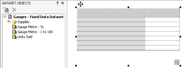
To define the widget, report objects such as attributes and metrics must be placed on the Grid/Graph. To successfully define a Cylinder widget, one attribute must be placed on the Grid/Graph's rows and one metric must be placed on the columns, as shown below. The Supplier attribute is placed on the rows and the Units Sold metric is placed on the columns.
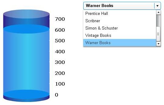
A selector alongside the widget is very useful. In this case, the selector will be used by a document analyst to switch between different suppliers (the attribute elements of the Supplier attribute).

The selector is designed as follows:
The DHTML Style is the Drop-down style.
The Target is the Cylinder Grid/Graph. In this case, this is Grid/Graph33, the name of the widget. The target ensures that the Grid/Graph is updated accordingly when an item is selected from the drop-down list.
The Source is the Supplier attribute. The source provides the attribute elements from the Supplier attribute to populate the selector.
For more information about creating selectors (and connecting them to Grid/Graphs or panel stacks), see Inserting a selector into a document.
The Cylinder widget only becomes a visual and interactive analysis tool when it is viewed in MicroStrategy Web. In MicroStrategy Web, the Cylinder widget presents a vertical cylinder with liquid in it; the level of the liquid within the cylinder depicts a specific metric value. In this case, the metric value is the number of units sold. Notice also that the look and feel of the selector changes in MicroStrategy Web.
To display the number labels on the right of the cylinder, right-click the cylinder and select Properties. By default, the minimum and maximum values for a Cylinder widget are 0 to 100. Since the metric values are much larger on this report, you should change the maximum value to something like 700, to accommodate the largest metric values on the report.
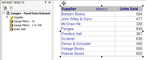
Another convenient addition to the widget/selector combination shown above is a grid version of the report. For this example, you might add the grid report shown in the Dataset Objects panel above. The grid report allows you and document analysts to see how one attribute element's value compares against other values. You can also sort the grid report and pivot objects on it. In this example, the full grid report allows you to see how one supplier's revenue compares with other suppliers. To add a grid report next to the widget, simply drag the report from the Dataset Objects panel and drop it next to the widget.
For procedural information, see Inserting a widget into a document.
Selectors allow a user to display different metrics or different elements of attributes, custom groups, or consolidations in a Grid/Graph (the target of the selector). Targets can be automatically maintained in a layout. This means that when you add a Grid/Graph or widget, the Grid/Graph or widget is the target of all selectors in the same panel or document section as the Grid/Graph or widget. For more information about automatically maintaining targets for selectors, including instructions to enable and disable the functionality, see Automatically maintaining targets for selectors.